Published by Jeremy. Last Updated on November 12, 2020.
Disclaimer: This Week in Blogging uses demographic data, email opt-ins, and affiliate links to operate this site. Please review our Terms and Conditions and Privacy Policy.
If you run a website and want greater insights into the actions users actually take on any given page, you may want to give heatmapping a try.
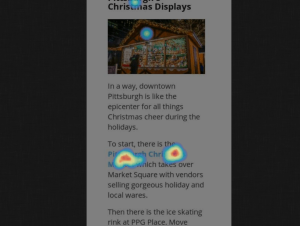
Heatmap services, like Hotjar, offer a wealth of performance data from actual users (overlayed directly on your site for a visible breakdown of click locations), and lets you get a glimpse into the user experience of your site far more than global analytics data provides.
When we installed this one on two sites for a test, I have to admit the results were striking!
What is a Heatmap and Why Use It on Your Blog?

A heatmap is a tool for your website that tracks visitor interaction on a specific page. If Google Analytics tells you site data in list format, heatmaps are, in a way, the equivalent of compiling some of that data visually with your own site as the backdrop.
This is an important piece of the puzzle as it helps give a better understanding of what users are actually doing when visiting your site. And instead of looking at it on an individual user level, heatmaps accumulate the data over time to give you a broader snapshot across all visitors to any given page.
There are a few huge benefits to this that we like to look at. In a quick view you can find out for any given article:
- The links that users are clicking on a lot, a little, or not at all.
- How far down your page users are scrolling.
- How the above two points vary on desktop, tablet, and mobile devices.
Put that altogether and you have a very powerful service with valuable data collection potential.
Our goal, like most others who use this kind of service, was to learn more about how users were actually engaging on two of our blogs. In the past, we optimized around which travel affiliate programs earned us the most money and had a good idea as of why, but we didn't have proof. We just knew that affiliate A outperformed affiliate B in very similar setups from trial and error.
By installing a heatmap we hoped to learn more about where users were clicking, and in turn, use that to try and improve our outbound clicks on affiliate links (priority) and pages per visit (secondary).
So we turned on heatmaps on our five or so most popular posts, a few popular landing pages, and our homepage on both sites and let them run. It didn't take long before we had some rather surprising results.
The Heatmap Results? In-Content Links Were King
As with most tests, you really want to have 1,000+ views/impressions/clicks before you start looking at data. But within a few days of turning on our heatmaps, we noticed a few surprising trends that were consistent across all articles:
- Very few people clicked on the links in our headers outside of our homepage.
- Very few people clicked on the links in our sidebar on desktop.
- Very few people, albeit more than the above, clicked on the links appearing after the end of an article.
- Virtually all our tracked clicks were on in-body links.
- When looking at the scroll data just 10-20% of users reached the bottom of our website at all.
- Even worse? Our Pinterest ‘Pin It' buttons appearing immediately after our articles would result in readership a loss of 20-30%!
The last point there is perhaps the most surprising to us because in previous affiliate tests we had optimized our footer to improve our outbound clicks and affiliate sales (and did so rather respectably, mind you), but our ‘Pin It' section appeared before that in every case.
With this test, we found that 20-30% of our readers left our site when they got to the ‘Pin It' section, and we quickly realized we're leaving money on the table with affiliate-oriented content that was featured after that. 20-30% was a substantial number of readers that never saw a single affiliate prompt at all!
Site Improvements Made from Using Heatmaps
As you can imagine, we quickly wanted to change our site design to help encourage more clicks in the spots that mattered. As we were planning on overhauling our links and sidebars anyway, testing with a heatmap gave us more valuable insight into the direction we wanted to move into.
Some of the notable changes include the following:
- Our header was changed to feature only main categories and minimize drop down links to prevent any decision paralysis.
- Our homepage, about page, start here page, and sidebar were all updated to promote these main categories for continuity.
- We added a significant amount of affiliate links within articles to help generate more clicks.
- We removed all “Pin It” images from the end of our posts. The pins were added to the featured Pinterest image in our social sharing plugin.
- Opening up this section allowed us to show affiliate oriented content closer to the ‘end' of an article.
- We reduced our footer to just a few key sections- affiliates (first) and read more (second).
After the changes, we tested things again. While we were still had low clicks in our header, we noticed a substantial change in our footer sections.
By removing our Pin It image, for example, we increased our views in the first two footer segments from 10-20% on average to 30-50%+. By organizing our footer content to be affiliates first and read more sections second, we significantly increased our views on things that are revenue producing.
More views here equated to more clicks, and more clicks equated to more revenue earned. Win!
This really validated a thought we had but could never confirm- once a user thinks they're at the end of a post, they are likely to leave right away. You have a very limited window to capture a user's attention beyond that, and the drop-off just one screen view down from the perceived end of content point is massive.
Learning this was perhaps one of the biggest takeaways we had in the heatmap tests with Hotjar, and it really helped us be much more strategic with site designs moving forward.
So if you're curious about where readers actually engage in your articles, be it for traffic, affiliate concerns, or just plain curiosity, running a heatmap on some of your most popular posts will provide a wealth of insights. I know it did for me!
For this study we used the heatmap service Hotjar. The service has free and paid options based on the total number of page views you would like to monitor, and many bloggers may find they can extract meaningful data with their free package for most pages.
Join This Week in Blogging Today
Join This Week in Blogging to receive our newsletter with blogging news, expert tips and advice, product reviews, giveaways, and more. New editions each Tuesday!
Can't wait til Tuesday? Check out our Latest Edition here!
Upgrade Your Blog to Improve Performance
Check out more of our favorite blogging products and services we use to run our sites at the previous link!
How to Build a Better Blog
Looking for advice on how to improve your blog? We've got a number of articles around site optimization, SEO, and more that you may find valuable. Check out some of the following!

